A preamble to using ACBA Maps
The National Geographic magazine has an excellent article by
Geoff McGee (12 October 2015) - How
to Make Maps and Influence People. It provides a brief over view of
the approaches uses to make their maps influential. Maps may or may not be
beautiful, but they are always intended to make an impact, to focus the readers’
or viewers’ attention on something important.
An extract from the McGee article states:-
“Mode says the historical
masters of persuasive maps, though, were the British during their imperial
height, when maps helped promote the size, power, and presumable invincibility
of a small island nation’s global empire. They used not just maps themselves,
he says, but also visual and geographical tactics to shape the viewer’s
perception.”
Before focussing on ACBA Maps, it is worthwhile considering
how maps have developed over the millennia.
Maps have always been designed to influence their readers.
The mechanisms employed to guide these create these influences are as important
as the maps themselves. Pure beauty is an important factor but, by no means,
the only one.
The evolution of maps has taken a long and winding road, according
to the blog UnEarthLabs.
It considers two artefacts which may have claims to the oldest maps known.
 |
| Figure 1- A cave painting from Turkey dated from about 6200 BC |
This is thought to be a representation of a city layout from
ancient Anatolia. It is 9 feet wide. There is scholarly disagreement as to
whether it is truly a map.
There is more certainty about the stone tablet below, which about the size of a modern day iPhone and dates from around 600 BC.
 |
| Figure 2- Babylonian stone tablet |
The blog suggests that the Babylonian tablet is as much a record of spiritual and cultural belief, as it is a map. Curiously, I suspect, that all maps have both spiritual and cultural influences irrespective of their primary purpose.
Maps have always centred on telling stories and influencing
their readers. The map below is from the 14th Century and is part of
a world atlas referred to as the Catalan Atlas. It is based on Marco Polo’s
travels. I was interested to see the extent to which this map included written
information, pictures and images that we would now describe as pictograms.
Distances and angles between known locations are distorted to allow for this
“extra” information.
 |
| Figure 3 - Marco Polo's travels (Catalan atlas – 14th Century) |
The use of the compass sparked a shift back to geographical
maps made for practical navigation. The magnetic properties of iron had been
known in China from about 2 centuries BC, but their ability to point north and
south consistently was not employed in map making until the Renaissance in
Europe. This coincided with a period of intense exploration and provided the
backdrop to one of the most important developments in mapping – the Mercator
projection. This allowed the projection of the earth’s spherical surface onto
to a flat surface consistently.
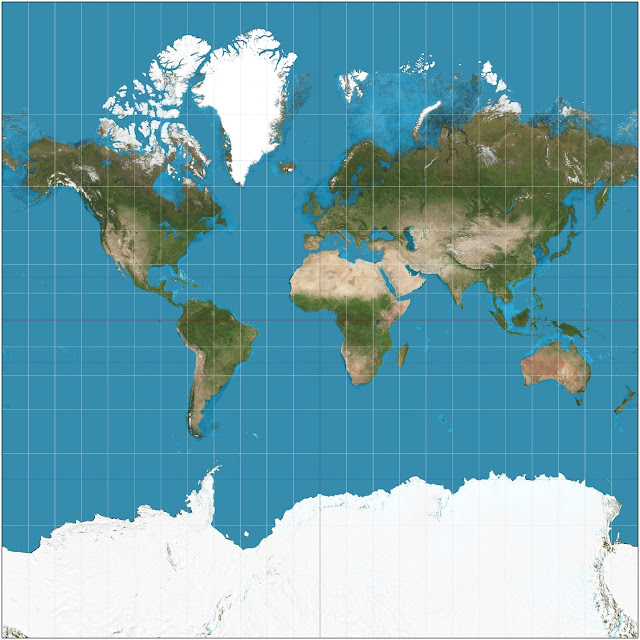 |
| Figure 4 - the Mercator projection of the world (modern) |
Of course this leads to strangely stretched and misshapen
outlines of land masses at the poles. However any single point on a land mass
is correct relative to its longitudinal position.
Refinements in Mapping
Everyday people were realizing that a map was an act of
persuasion, a visual rhetoric. In 1553, gentry in Surrey, England, drew a map
of the town’s central fields, to prove these were common lands—and that
villagers thus should be allowed to graze animals there. However, in many
respects the French were the leaders in this technology, especially when it
came to the use of icons and pictograms.
 |
| Figure 5 - Early symbols for water crossings (France) |
Francois de Dainville, in his Le Language des Geographes
(1964, p. 162), compiled map symbols for various water crossings from
historical European maps (1543-1777).
 |
| Figure 6 - Early symbols for fords (France) |
By the late 19th century, the surge in mathematic reasoning
and measurement technology made mapmaking explode. In France, the Cassini
family crisscrossed the country to calculate its dimensions with precision
never before seen. Their trick? Using “triangulation”—a bit of trigonometry—to
let them stitch together thousands of measurements taken by peering through the
new, high-tech “theodolite.” Breakthroughs in binocular lenses allowed
surveyors to measure scores of miles at a glance. World maps became
increasingly accurate.
Local mapping became deeply granular. The British Ordnance
Survey began mapping the U.K. down to the square yard, and the German
entrepreneur Karl Baedeker produced similarly nuanced maps of European cities.
Tourists could now confidently tour foreign realms, their annually updated guides
in hand, able to locate individual buildings, much like today’s citizens
peering at Google Maps on their phones. Being prominent on a local map was
valuable to merchants, so mapmakers in the U.S. sold the rights. “If you paid
more, you’d get your building cited,” Short notes. “It was like advertising.”
Pictograms, the Key to Interpretation and Contours
Originally, the visual impact of maps was very direct. The
map was both a picture with words to describe the detailed meaning of the
image.
 |
| Figure 7 - Mercator World Map 1569 |
The above Mercator World Map from 1569 includes a good deal of explanatory text. There are also a range of small images which could be the equivalent of modern pictograms. However, there is no key or explanation of what they might represent. There is very little interpretation required of the reader. The visual impact is almost instant.
Over the centuries mapping has become much more subtle and
capable of conveying a wide range of information or, in some cases,
misinformation.
According to the Nielsen Norman Group: “In addition to conveying brand personality through color and style, icons must first and foremost communicate meaning in a graphical user interface. Icons are, by definition, a visual representation of an object, action, or idea. If that object, action, or idea is not immediately clear to users, the icon is reduced to mere eye candy.”
However, meanings are not universal. In order to create an
effective icon, one must consider the context of usage—the environmental,
societal, political, and psychological factors that contribute to the reason
why they are using the icon in the first place.
 |
| Figure 8 - Icons in the 17th Century |
In many cases mapping icons are self-explanatory. However,
over time, icons have become more abstract and context dependent.
A
Here is an extract of the information provided on the UK’s
Ordnance Survey maps.
 |
| Figure 9 - Mapping symbols and their meanings (an Extract from the Ordnance Survey) |
Consider a landscape as shown below, together with its
associated map.
 |
| Figure 10 - A landscape and its associated OS map |
 |
| Figure 11 - An irregular hill and its profile from contour lines |
Contours allow the map reader to visualise the landscape in
3 dimensions even though it is presented on a flat (two dimensional) surface.
Mathematicians will recognise that this representational
approach can be extended beyond three dimensions. There can be real
difficulties when seeking to represent this on a flat surface. However, the
images of a black hole from NASA can be regarded as a pictorial
representation of huge amounts of data which has been analysed logically.
Mapping the Night Sky
Since the distances between Earth and individual stars or
galaxies are so huge, the mapping of the night sky might (in terms of distance
from Earth) appear to be an obvious subject for consideration. Ethan Seigel’s
article “How
far away are the stars?” discusses the difficulties.
From the map maker’s perspective these difficulties are not
solvable, because there is no correlation between position in the sky and
distance from Earth. One near star or galaxy could easily hide a more distance
one. This represents a fundamental distinction between mapping objects in the night
sky and mapping the surface of the earth whether above or below the surface of
the sea. We cannot generate a contour line of stars that are equidistant from
the earth.
The mapping of the night sky is conceptually different from
mapping the surface of the Earth.
Mapping the Sea Bed
Authoritative sources claim that 71% of the earth’s surface
is covered by water. But delve a little further into this figure it becomes
very difficult to define exactly what this statement means. Does it include
ponds, rivers and lakes? What about seasonal floods or occasional lakes? Are
the icecaps of the Artic and Antarctica included? No doubt there are valid
answers to these questions, but they all fundamentally concern land and water’s
presence in that context.
In contrast less than 20% of the earth’s oceans have been
mapped in any detail. By detail I mean the shape and composition of ocean or
sea beds. For comparison, we know far more about our nearest planetary
neighbours.
This gap in our knowledge has been recognised for over a
hundred years (The History of
GEBCO), but the methodologies we use for mapping the earth’s land
masses (essentially light waves), cannot be applied in water. We first started
mapping the shapes of river floods using plumb lines. These were then extended
to relatively shallow seas.
The advent of sonar in the mid-20th century was a
major advance for mapping shallow seas. There are major technical difficulties
for interpreting sonar for deep oceans. Although satellite mapping has allowed
fairly low-level resolution for the deep oceans, there is a need for far more
detailed coverage. This need has been recognised and is being pursued actively
by the organisation Seabed
2030.
 |
| Figure 12- Atlantic Ocean at low level resolution |
Mapping Spreadsheets – Connection?
Google’s dictionary defines a map as ‘a diagrammatic
representation of an area of land or sea showing physical features, cities,
roads, etc.’ This seems overtly earth bound. Alternatively, Wikipedia offers ‘A
map is a symbolic depiction emphasizing relationships between elements of some
space, such as objects, regions, or themes. Many maps are static, fixed to
paper or some other durable medium, while others are dynamic or interactive.’
This definition covers all the elements reviewed above, but how does it apply
to spreadsheets. After all spreadsheets are already two dimensional. Why do we
need a Map?
In reality, spreadsheets are always at least three
dimensional. The rows and columns of the cell grid, together with their
contents as shown to the user, represent two dimensions. The third dimension is
represented by the formula that manipulates the contents of the cell. Microsoft
has also introduced additional dimensions, for example cell comments.
With the exception of Array Formulae, the formulae in
adjacent cells are nearly always slightly different to each other as one moves
down (or occasionally across) the grid. The purpose of mapping spreadsheets is
to identify which groups of formulae are conceptually the same and to map their
location in relation to the whole spreadsheet.
Downloading ACBA Mapping
Access to Help
There is a discussion group dedicated to providing a forum for help and information - Excel - Cell Mapping. I recommend you join the group.
Alternatively, you can email me directly from the Stephen Allen link within the form.
Comments
Post a Comment